But What if it Works?
/Getting Your Restaurant Off The Ground
Several times in my career I’ve experienced restaurant projects that I just can’t get off the ground. This has always been down to clients who keep changing their minds about the design and putting the launch date back, mostly for flimsy reasons. I even had one small project that went on in an endless spiral of unnecessary design revisions and self-imposed setbacks for 8 years. In the end I had to remove myself politely because I couldn’t live with the frustration and disappointment.
This typically happens between couples or businesses run by families or committees who are not comfortable together. I’ve noticed that they seem to appoint advisors as relationship counselors or mediators instead of facing up to their own internal differences.
The Indecisive end up wasting huge sums on drawings and designs that never get implemented. So, whilst consultants like me get paid, the wasted effort is too big a drain on our creativity.
The strange thing is that it's always my best ideas that get squashed so I’ve come to the conclusion that the problem is not fear of failure but fear of success.
Because if the design works, things are going to change and, although I embrace it, not everyone else is ready. Some prefer the idea to the reality.
Asteroid Impact
I think that the answer is to set a clear timetable and agree the launch date up-front. You can then set deadlines after which decisions made can only be changed in exceptional circumstances - asteroid impact for example.
Get everyone to buy in and then launch. Ready or not.
How to Think About Colours Professionally
/Colours define the type of customer who a restaurant will appeal to. They define the emotions that the design has to convey and they start the conversation with the customer. Before they've even read the name on the sign over the door people have understood what its colours say.
Colours can set the design apart from competitors (or make it fit in) and they can act as a visual shortcut to instant brand recognition. This is why big brands select very precise colour schemes and stick to them.
Colour selection is often not given the professional attention it deserves. I like to select colours very early on in the design of a restaurant before pretty much all the other work and as soon as I've clarified my client's instructions, researched competitors and defined the target.
Non-designers nearly always get this wrong. To tell the truth so do many paid designers. Mostly because they choose the colours they like personally.
I always employ a trained Colour Psychologist even on the simplest projects. It makes a huge difference to the outcome and potentially to the success of the whole venture.
By way of example here's a colour palette I just produced with my team for a small Indian restaurant. (I'd publish something for a bigger project but it wouldn't fit.)
13 Fruit Pies And Other Short Stories
/Too Many Prawns
I had a delicious lunch in an Indian restaurant recently and then someone reminded me of this famous quotation . . .
"A designer knows he has achieved perfection not when there is nothing left to add, but when there is nothing left to take away."
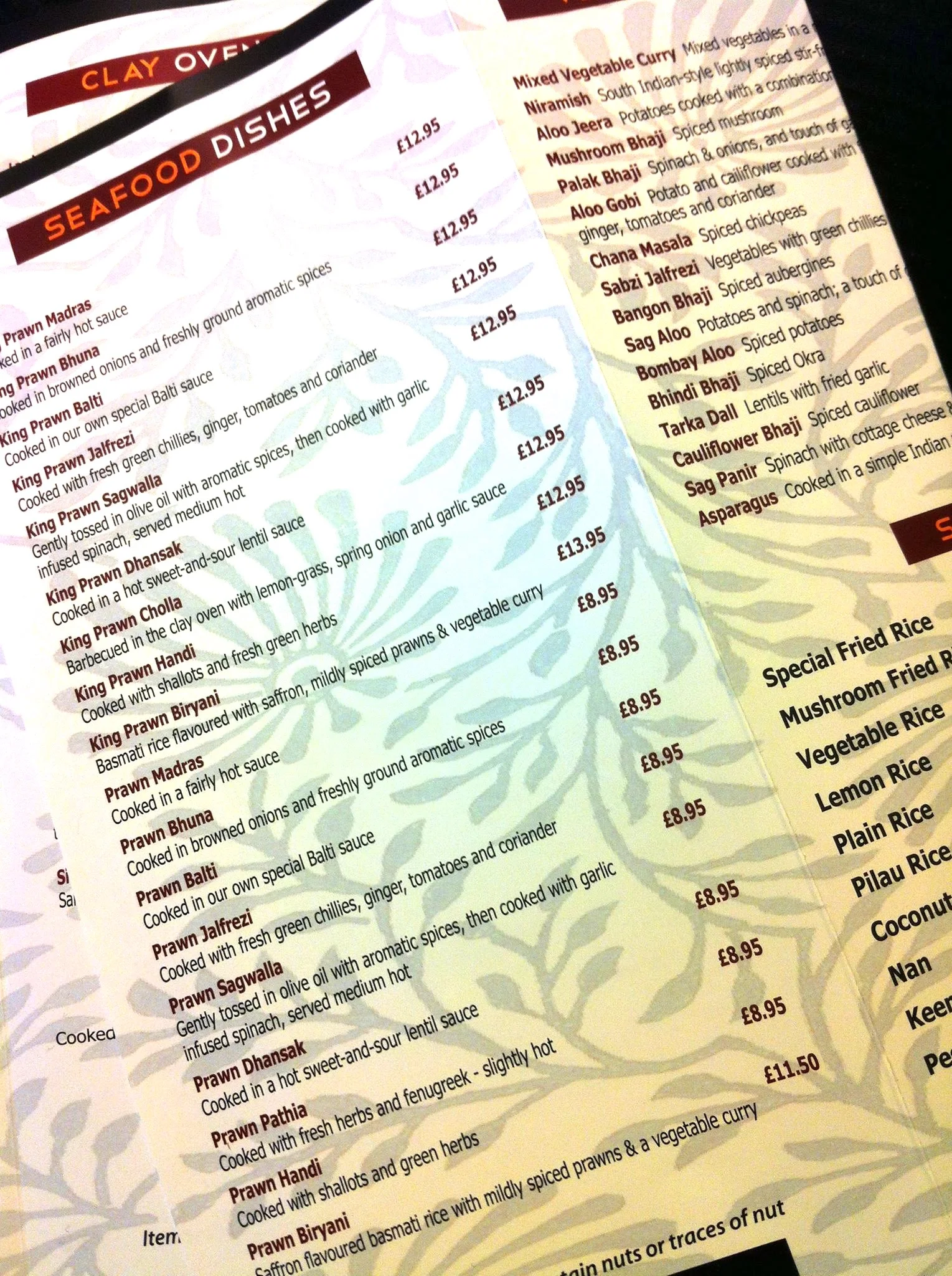
This made me wonder if all 18 King Prawn dishes on the fish section the huge, multi-section menu were really necessary and why so many restaurant owners fall into the trap of thinking that offering their customers more options leads to greater profits.
18 Prawn Dishes In One Section of One Menu
The Paradox of Choice
The Paradox of Choice - Why More Is Less, is a book by American psychologist Barry Schwartz. In the book, Schwartz argues that eliminating consumer choices can greatly reduce anxiety. Here’s why: we humans are more afraid of making the wrong choice than we are of making no choice at all so when confronted with a large array of options we’ll most likely either buy the one we already know we like or we’ll buy nothing.
You might think that this means that you have to offer every customer a dish that they already like but that’s what leads to an unmanageable menu (perhaps with too many prawn dishes) to anxiety for your customers and to an inefficient business that’s difficult to manage.
The World’s First Business Computer
Most probably you’ve never heard of Lyons but chances are that if your grandparents are British they’ll remember them with affection.
In 1894 Lyons started as a teashop in Piccadilly, London and, from 1909, developed this into a vast nationwide chain of teashops known as Lyons' Corner Houses. Lyons also ran high class restaurants and hotels. From the 1930s Lyons began to develop a pioneering range of teas, biscuits and cakes that were sold in grocery stores across the world.
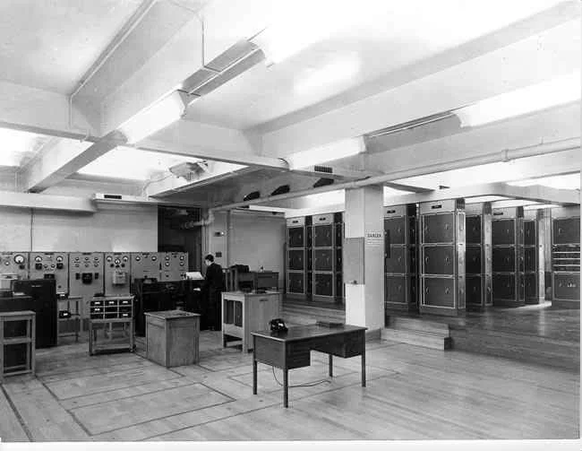
Leo 1 - The World's First Business Computer
After the second world war the top management of Lyons foresaw the need of new electrical computers for organising the distribution of cakes and other highly perishable products. Therefore, they helped finance the University of Cambridge's Electronic Delay Storage Automatic Calculator (EDSAC), built their own programmable digital computers and, in 1951, became the first business to use a computer. The Lyons Electronic Office, LEO 1, It handled the company's accounts and logistics.
Of course by today’s standards LEO 1 was slow and crude. It was also huge, taking a whole large room to create the computing power of a modern hearing aid. Nevertheless, it enabled Lyons to analyse sales data in unprecedented detail.
13 Fruit Pies
When I was a small kid in London Lyons Individual Fruit Pies were a treat that we always took on family picnics in the country. First introduced by Lyons in the 1930's, long before I was available to eat them, these square-shaped pies had fruit or fruit puree fillings and were individually boxed.
Eventually, and perhaps due to the analytical power of early computing, the individual pies were made in 13 different flavours: apple, apricot, raspberry, rhubarb, gooseberry, mince, blackberry & apple, blackcurrant, cherry, orange, peach, pineapple, and lemon curd. Sometimes these flavours changed but as one was added another was taken away so that the total range only ever numbered 13 choices.
It turns out that 13 flavours are the optimal range of choice. Jam manufacturers’ too found that any more choice than 13 options often leads to lower sales, not more.
Worth remembering then because the chances are that if you have fewer than 13 choices on your menu, your restaurant will do better, not worse.
When to Protect Your Profits
/I hear from many restaurants of all sizes whose owners are managing decline. Normally it’s too late to help them because they’ve run out of capital.
The best way to avoid this problem is with foresight when you’re a success and making money. If you’ve waited for regular customers to stop coming you’ve left it too late and you may get sucked into a whirlpool from which there’s no escape.
I think this is worth repeating, staying clear of the downward spiral before it gets expensive and difficult is far better than paying a premium in a rush when it becomes an emergency and your money's all spent.
Good design; kept up to date, is a cheap, highly leveraged way to retain your customers and attract even more. The cost of a refurbishment and re-brand that will last a decade or more is normally less than the value of 6 months’ of sales for a successful restaurant and a tiny fraction of the cost paying its staff and rent over its lifetime. What's more it nearly always pays for itself with renewed customer engagement.
The magic of slack (surplus profit or capital or a little extra time in the refurbishment process) is that it gives you the resources to stop and avoid problems or fix them when they’re small.
Over-optimized and fast-growing restaurant chains often misunderstand the value this slack, they always wait until something is a pressing emergency, because their owners don't have a moment to spare. Expensive.
Careful design now is almost always cheaper now than rushed design later.


